Idaho Steelheads Reveal New Logo Design
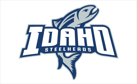
Professional ice hockey team the Idaho Steelheads have unveiled an all-new logo design ahead of the 2017–18 ECHL season, which officially gets underway tomorrow.
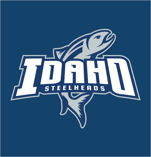
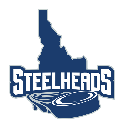
The team has revealed both a refurbished primary logo that will be used this season, as well as a new secondary logo that will be utilised on alternate jerseys going forward.
The Steelheads’ new primary mark preserves the features of their previous logo, with the vertical Steelhead fish underneath the team name. The logo has been altered with a different font and a new colour scheme to offer a more “sleek and modern dynamic”.
“We felt the logo needed a refreshing. The balance of it certainly is better now,” said Eric Trapp, president of the Steelheads. “We think the design and the lettering are sharper, but we’re also preserving the mark our fans love and identify.”
The team will incorporate shades of black, silver, and navy blue in their uniforms.
“We’re going into our 21st season and it’s kind of the mark of a new era,” added Steelheads head coach Neil Graham. “It’s important to remember where we came from, but it’s also important to evolve and stay current.”
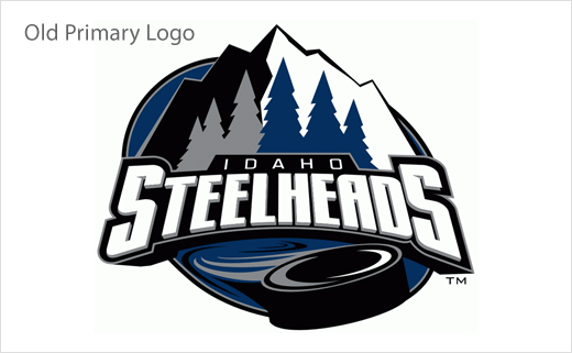
The secondary logo includes the swooshing puck along the Boise River that the Steelheads featured in their ‘mountain-scape’ logo, which served as the primary logo through the late-2000s. The new logo design has replaced the mountains and trees in the background, with the new design having the puck sweeping across the state of Idaho.
“We’ve again incorporated the state of Idaho, which we thought was more appropriate branding for us. We’re proud of our home state and we love the iconic look of the state of Idaho,” said Trapp. “It’s a look that we think is dynamic and unique to our team.”
Source: Idaho Steelheads


