Seattle Seahawks Unveil New Alternate Logo Design
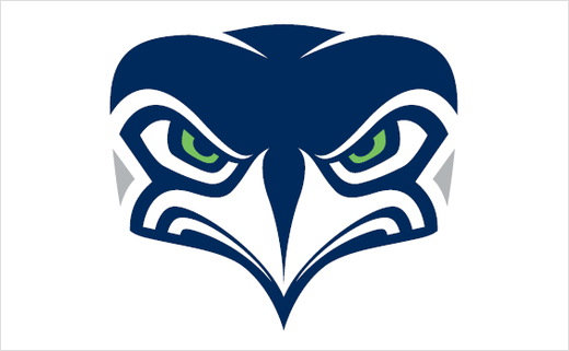
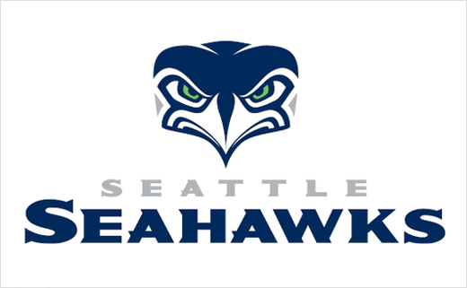
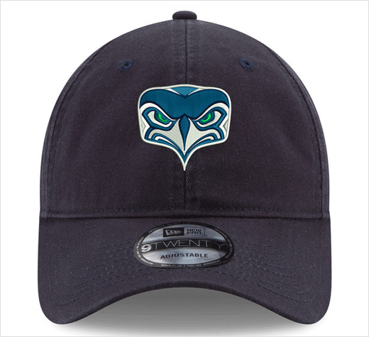
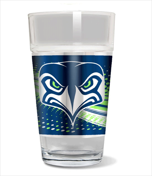
American football team the Seattle Seahawks have revealed an all-new alternate logo design.
Created by a graphic designer Kevin McCoy, the design process for the new logo is said to have taken over two months, and included several rounds, multiple revisions and a total of 36 logo proposals.
“The first round was nothing but exploration with a variety of styles and designs,” says McCoy. “In the following rounds, the Seahawks and the NFL came together to adopt something new, while maintaining the brand.”
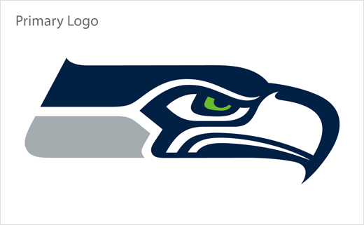
The alternate look shows the team’s primary Seahawks logo, which is seen at a profile angle, facing forward. It maintains the same colour scheme — “College Navy”, “Wolf Grey” and “Action Green” — that Seattle unveiled in 2012 when the NFL introduced Nike as the League’s new uniform provider.
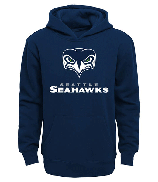
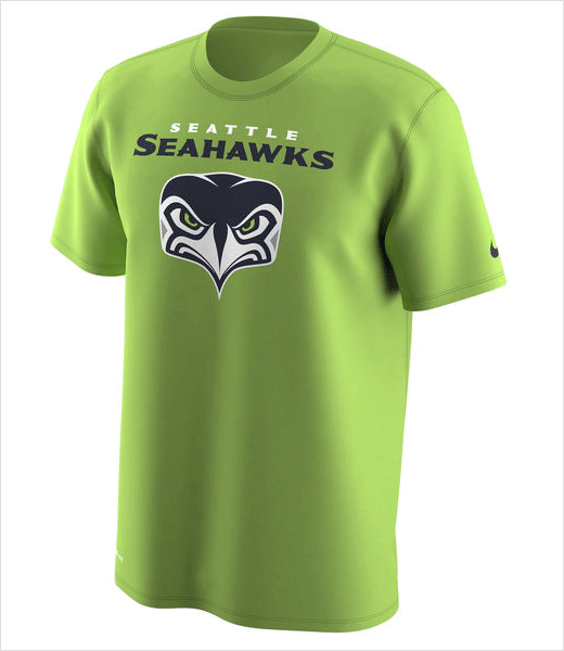
While the alternate logo will not make its way onto the team’s uniforms, helmets, or gameday gear, it will be incorporated into the club’s overall branding and will feature on various Seahawks-related merchandise as well as in-stadium entertainment.
The Seahawks originally unveiled their name and logo back in 1975, with the name having been selected from a list of 1741 names submitted by fans. The “totem pole” look of the original logo also served as a nod to Seattle’s Native American culture, and the new secondary logo’s design further reinforces this historical association.
Source: Seattle Seahawks


