Pentagram Rebrands U.S. Restaurant Chain, Tender Greens
Pentagram has rebranded U.S. restaurant chain, Tender Greens. With 24 branches currently in California, the business has undergone an identity overhaul as it plans to expand nationally in 2018.
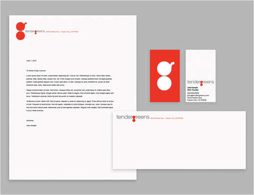
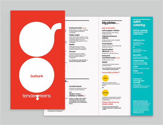
The refreshed look includes a new logo, custom font, mobile app, website, uniforms, packaging, and menus, as well as a restaurant redesign.
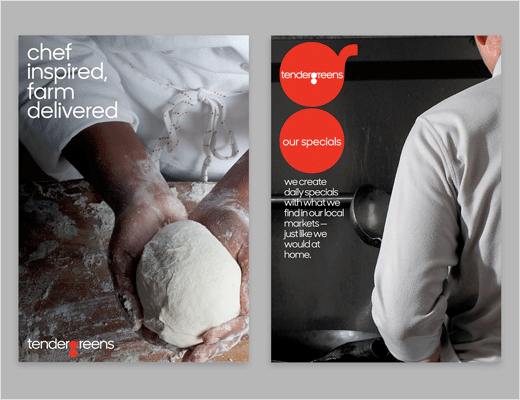
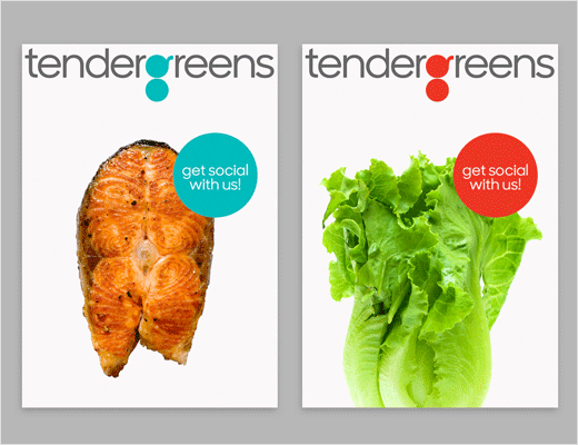
“Tender Greens is a true chef’s kitchen, and our goal in conveying this modern, upbeat fine casual experience was to make it a real tribute to the chef’s cooking,” says Paula Scher, partner at Pentagram. “We were inspired to create a logotype showing an overhead view of a pan in silhouette. We created custom typography and use the ‘g’ to help communicate the daily specials, often through the use of photographs.”
The tomato-red “g”, formed by two stacked circles, can appear both on its own as a symbol, or accompanied by the full wordmark, which is set in a customised version of the typeface Sharp Sans, with the “g” redrawn with round counters.
The new store design, meanwhile, incorporates light-coloured woods, an open kitchen, black and white tiles, and pendant lighting.


Pentagram
www.pentagram.com


