New Logo and Identity for Hive by Wolff Olins
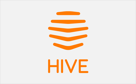
Wolff Olins has designed a new logo and visual identity for Hive, the British Gas-owned smart heating brand.
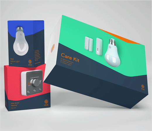
Launched back in 2013, the business has since expanded both geographically and in terms of new product offerings such as security sensors and light bulbs, and company bosses therefore asked Wolff Olins to help them bring their new multi-market proposition, 'Living Brilliantly' to life.
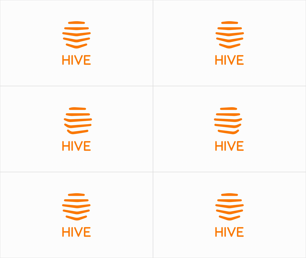
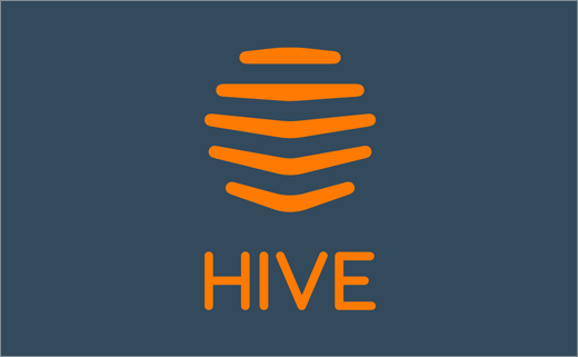
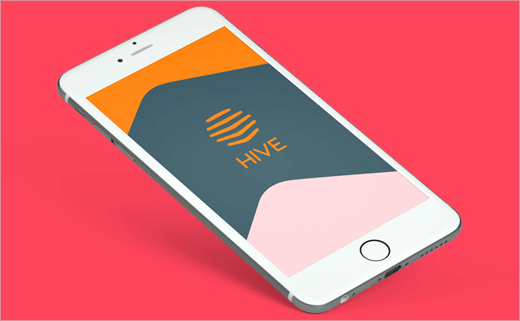
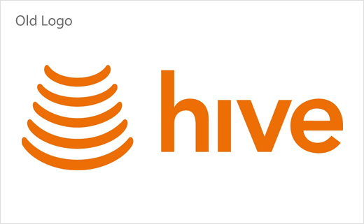
While the new look keeps Hive’s prominent orange colour, there are more noticeable changes to the main logo. For example, the previous radar-like icon gives way to a beehive symbol that now looks more like an actual beehive, especially in its 3D animated form. The accompanying typeface has also been revised, with the old sans-serif lowercase letters giving way to slimmer and neater-looking all-capitals.
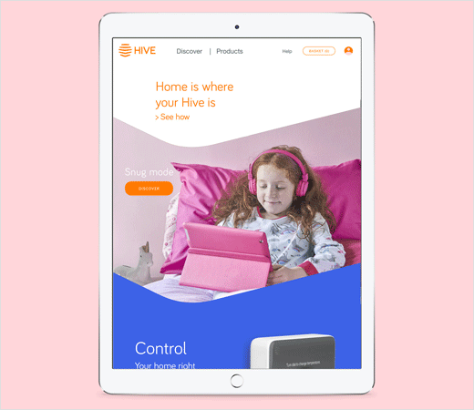
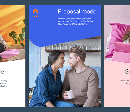
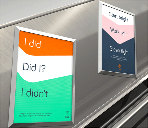
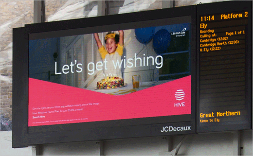
"We created a dynamic, connected identity that could stretch across all Hive platforms and channels. Led by a new, living mark, the brand visuals use panels and shifting perspectives to reflect the uniqueness of our homes," explain the designers. "While the tone of voice and photography have been crafted to help the brand tell more human stories about the diversity of smart homes solutions for real people."
The refreshed identity has already launched in the UK, Ireland and seven new North American territories, namely, Houston, Dallas, Washington D.C., Atlanta, Denver, Seattle and Vancouver.
Wolff Olins
www.wolffolins.com


