Portland Trail Blazers Unveil New Logo Design
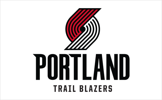
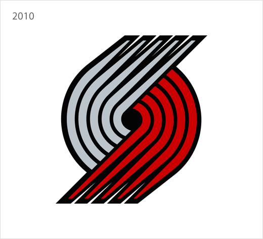
For the first time since 2002, NBA basketball team the Portland Trail Blazers is updating its logo, with the introduction of subtle changes that are claimed to have been driven by fan input.
“We gathered plenty of fan feedback and support on this direction for modernising our primary logo, while staying true to our heritage and maintaining its place as one of the most unique logos in professional sports,” said Chris McGowan, President and CEO of the Trail Blazers. “Together, we landed on subtle changes that provide a nod to our past while allowing us to modernise other aspects of our creative assets.”
The timing of the logo’s evolution coincides with Nike becoming the provider of all NBA team uniforms, licensed apparel and merchandise beginning with the upcoming 2017-18 season.
“Based on the fan feedback we received about uniforms and having the talented ideation of the renowned design staff of Nike, we’re seizing the opportunity to add contemporary touches to our classic on-court look and push the creative limits with some alternate versions,” said Dewayne Hankins, Chief Marketing Officer for the Trail Blazers.
Since the team’s inception in 1970, the Trail Blazers logo has been the subject of both admiration and diverse interpretation. The concept represents a graphic interpretation of five basketball players from one side against five players from the opposing side rotating around a centre circle in a pinwheel-like motion. It underwent its first modernisation in the mid-1990s, and received additional design changes in 2002.
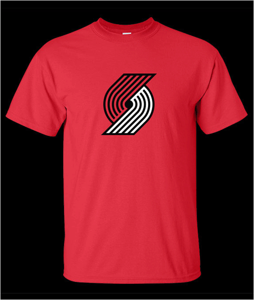
The latest pinwheel is reminiscent of the team’s original 70’s logo that was constructed with evenly spaced lines and congruent edges. However, the new design features lines that are now angled at exactly 45 degrees, an element which symbolises the fact that Portland sits on the 45th parallel.

Source: Portland Trail Blazers


