FAB Ice Lolly Gets New Logo and Packaging by Springetts
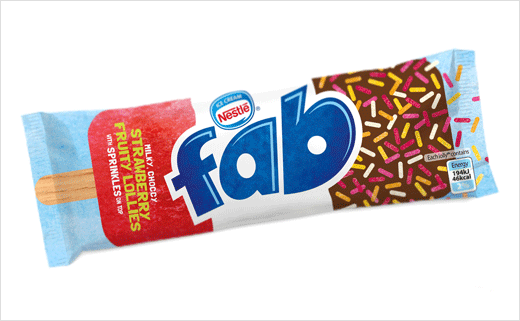
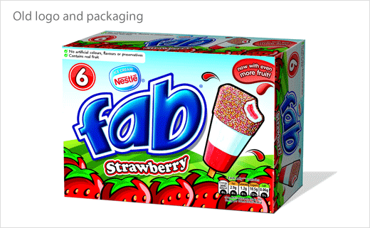
Branding consultancy Springetts has redesigned the logo and packaging for FAB, arguably the UK’s most well known ice lolly brand. The new look has been created to mark the product’s 50th anniversary.
“The packaging had evolved to look like every other lolly brand in the freezer. Everyone recognises a FAB and the packaging should be no different. We discovered that outside of FAB everyone was using the trio of colours far more iconically than the brand themselves,” says Springetts. “We did not however want the brand to be only about nostalgia. This had to be a complete reinvention like the Mini Cooper.”
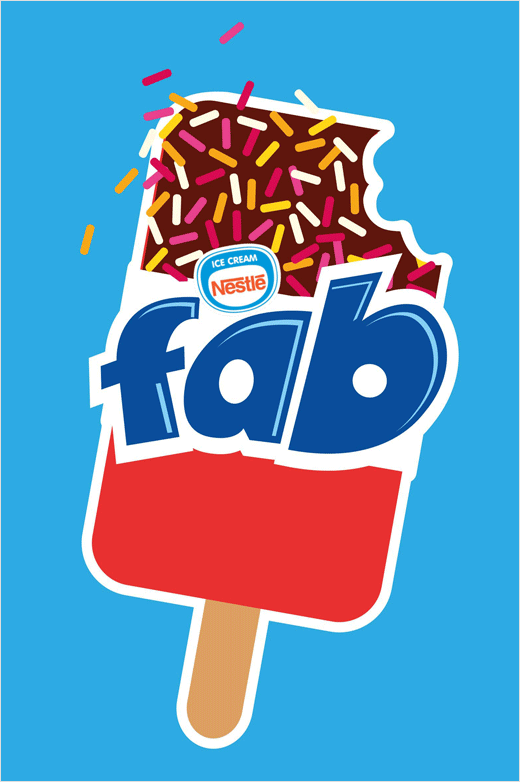
With the primary goal being to make the brand as famous as the lolly itself, the designers made the lolly the hero and reconnected the brand back to the product. The typography – considered to be “over-engineered” – was also stripped back to something that is now deemed more simple and fun.
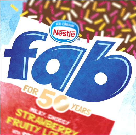
The product descriptors, meanwhile, have actually come from a 5 year old, who on tasting the lolly described it as “milky, choccy, strawberry…with sprinkles on top”.
“We thought it described a FAB perfectly and so used it on the packs,” say the designers.
Springetts have also created a limited edition ‘birthday cake’ flavour to celebrate the brand’s 50th birthday with a campaign around being “fab at fifty”.
Springetts
www.springetts.co.uk


