Fanta Reveals New Logo and Bottle Design
Soft drink Fanta has been reimagined, resulting in what company bosses are saying is the biggest change to the brand in its history.
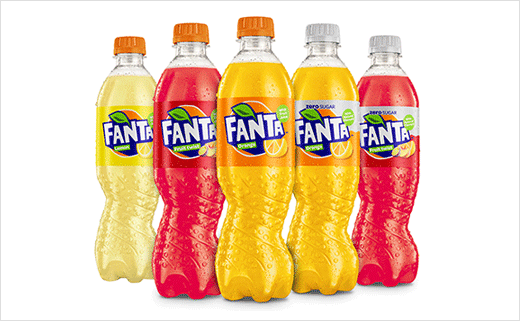
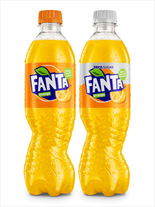
The transformation will see a new visual identity, the introduction of an asymmetric, spiral bottle and a new recipe for Fanta Orange which is claimed to contain a third less sugar.
At the heart of the brand’s transformation is a new visual identity, designed to reflect Fanta’s so-called “fruity, fun and vibrant nature”.
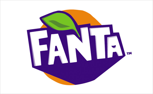
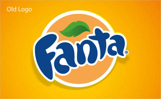
Driving the new look is a refreshed logotype, created using hand cut paper and then transformed into a digital design. As a result, the previous rounded sans-serif typeface gives way to a more upright and angular looking typeface. Details include a hidden smile, and the famous Fanta orange is highlighted by a new colour palette which has been designed to create more impact on shelf.
The new bottle design, meanwhile, is being claimed as an industry-first. Nearly two years in the making, it replaces traditional, symmetrical designs with a spiral version which twists the plastic to form what the designers say is a unique, eye-catching shape. The new bottle will feature across 500 ml and two litre formats.
“This year looks set to be the biggest in Fanta’s history, with a fresh new look inside and out,” says Aedamar Howlett, marketing boss at Coca-Cola’s UK division.
Coca-Cola originally launched Fanta in Italy in 1955. The new visual identity will roll out in stores from April this year with the new Fanta Orange recipe launching in May.
Source: Fanta


