Article Redesign Brentford Football Club Crest
Brand consultancy Article have redesigned the crest of Championship football club Brentford.
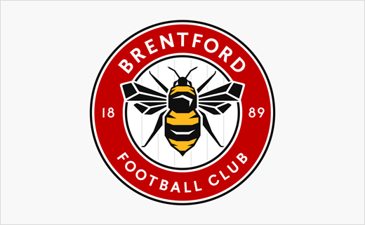
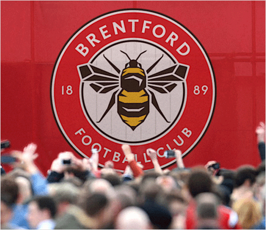
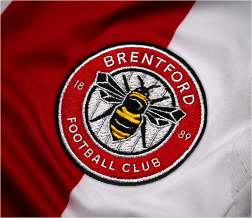
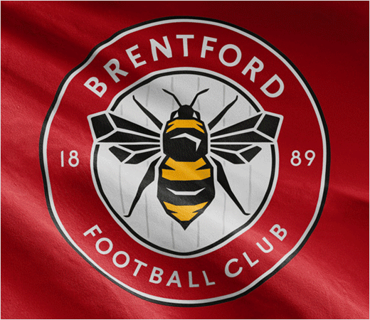
Featuring a large illustrated bee in a traditional roundel shape, the club’s new badge has been designed to reflect The Bees heritage as well as work effectively across all digital and printed media.
The crest design is said to be the result of an “extensive” consultation process, including interviews and focus groups with fans, players, management, directors and the owner.
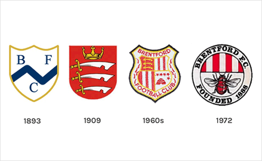
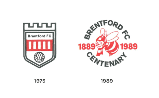
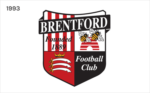
The designers say the process revealed that most fans and stakeholders were open to change and not significantly attached to the current crest as it was only designed in 1993.
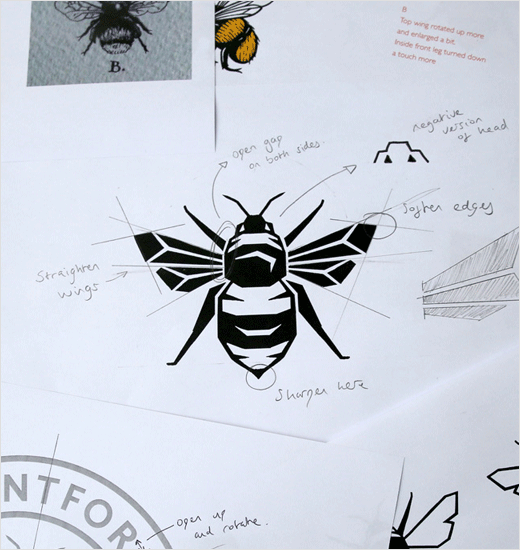
Article commissioned specialist illustrator Peter Horridge to draw the final bee in an effort to ensure it is flexible and can be applied effectively in full colour, single colour and as a standalone graphic element.
“Stylistically the final bee uses angular corners and details to make it appear aggressive and competitive while the typefaces were chosen for their timeless characteristics and legibility at small sizes,” explain the designers.
The new crest is part of Brentford’s strategy to make itself Premier League-ready by the time it moves into its new stadium. It will be worn by players from the start of the 2017/18 season.
Article
www.wearearticle.com


