Pentagram Designs New Identity for Eurosport
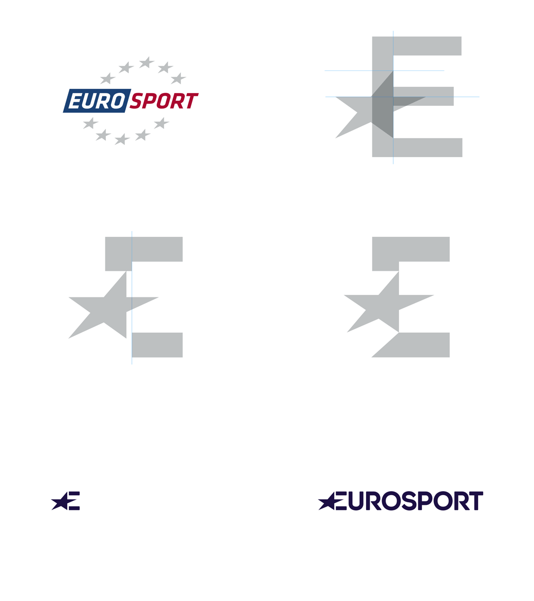
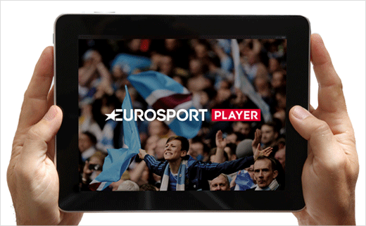
Pentagram’s Angus Hyland has designed a new identity for Eurosport, the pan-European television sports network that encompasses six TV channels and 16 websites, introducing the first change to the broadcaster’s visual brand in over 25 years.
The rebrand follows Discovery’s acquisition of Eurosport which after it bought a majority stake in the sports destination in May 2014 and was completed in a €491m deal in October 2015. It also marks the first time that the brand has changed its core visual elements.
Hyland and his team worked with Federico Gaggio – a strategic brand consultant to Eurosport – and DixonBaxi – who worked on the on-air branding and the advertising creative.
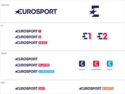
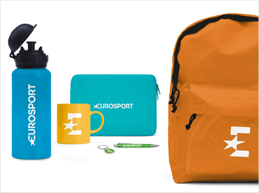
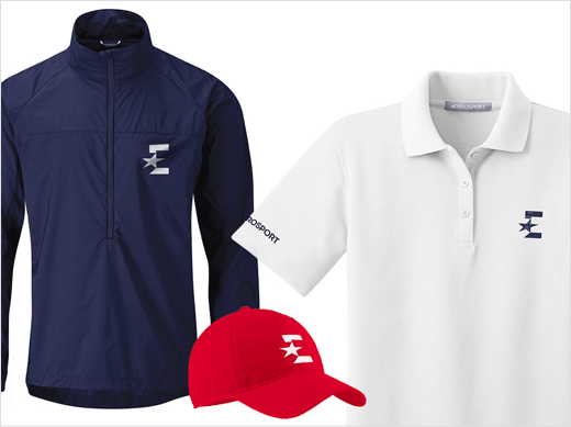
“We decided to use only a single star and keep its dynamic geometry,” says Hyland. “We also incorporated it into the E of the new single word logotype. This new pared back logotype is joined by a monogram, which is used for social media and merchandise.”
The monogram also gives a nod to the channel’s new parent company. This is through the incorporation of the single star into the E, which uses a similar visual language to the small blue globe that sits within the D of the Discovery logo.
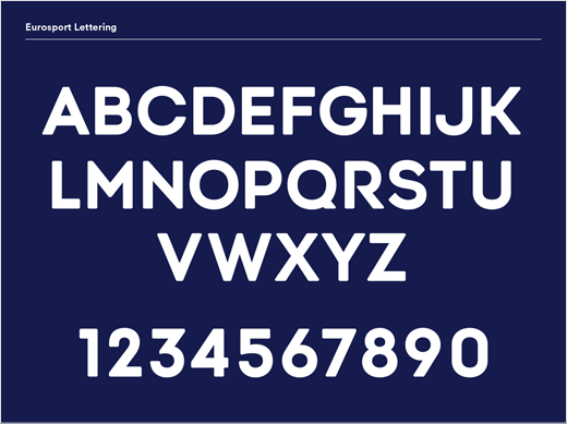
Red and blue have been retained as primary brand colours, but have been updated. An additional colour palette has also been developed to identify standalone products and to provide a flexibility for temporary applications, like marketing campaigns. The rebrand also introduces three new typefaces, Alpha Headline, Circular and Lexia.
Pentagram
www.pentagram.com


