Coley Porter Bell Modernises Logo and Packaging for OXO
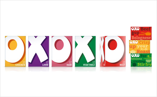
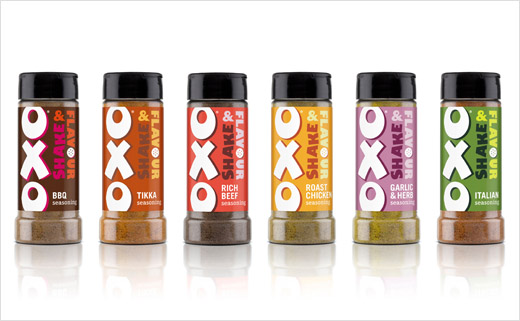
Branding agency Coley Porter Bell (CPB) has revamped the look and feel of OXO for its Cubes and Shake & Flavour range. The work is set to roll out at the end of January and aims to modernise the brand without losing historical design elements.
For the cube range, the agency says it created an “ownable tone of voice” that aims to reflect the brand’s personality, which is defined as “fun, inviting and inspiring”.
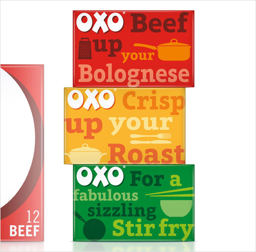
The top of the packs feature an array of messaging which aim to encourage consumers to use the cubes in different ways, for example: “Liven up your Lasagne”; “Sprinkle for spectacular stir fry”; “For pies packed with flavour”; “Beef up your Bolognese.”
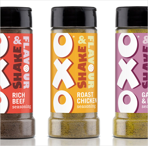
In line with the cube range, the Shake & Flavour variety features a new logo that aims to further bolster the brand identity.
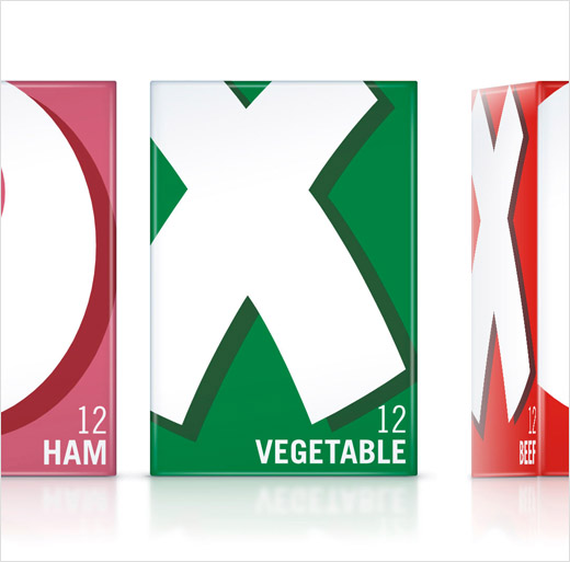
Stephen Bell, executive creative director at Coley Porter Bell, commented: “OXO and OXO Cubes are iconic, but over time the packaging had become overly complicated and fussy. We stripped all this away and enlarged the OXO letters as they stand for so much, we wanted to reinstate a boldness and confidence along with great shelf impact.
“Adding to that, we created an engaging ‘foodie’ message punctuated with ‘mealtime’ imagery on the top of the packs adding personality and delivering ‘flavour transformation’ cues. Having established this stronger look and feel, we were then able to translate this on to the Shake & Flavour range, making it more boldly OXO, more characterful with a rainbow of flavourful and vibrant colours.”
Coley Porter Bell
www.coleyporterbell.com


