Hootsuite Rebrands, Unveils New Logo Design
Social media management system Hootsuite has undergone a rebrand.
“Our rebrand is about more than following the prevailing design trends of the day, but after five years, our logo was long overdue for a refresh. We looked to best-practice examples in our industry and beyond for inspiration,” said Ashley Jane Brookes, marketing lead for Hootsuite’s brand and content strategy.
The company says it has followed the example of Twitter, which has updated its icon over time, from a character-like Larry the Bird to a simpler icon composed of three overlapping circles.
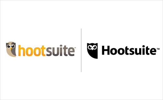
In similar vein, Hootsuite has revised its brand mascot, Owly, who is now rendered in black and white. The owl symbol was previously depicted wearing a variety of differently coloured outfits.
“Owly, as a mascot, remains a core element of our culture and our brand. The new design is a clean, fresh icon which reflects the simple, reliable, and confident aspects of our brand,” explained Brookes.
Company boss Ryan Holmes, vice president of marketing, Dee Anna McPherson, and a group of designers, writers, and marketers, some of whom were among the first employees at the company, were all involved in creating the new look.
Vancouver-based design agency Vigilantes managed the rebrand.
Source: Hootsuite


