Identity Design for Copenhagen’s ‘Hotel d’Angleterre’
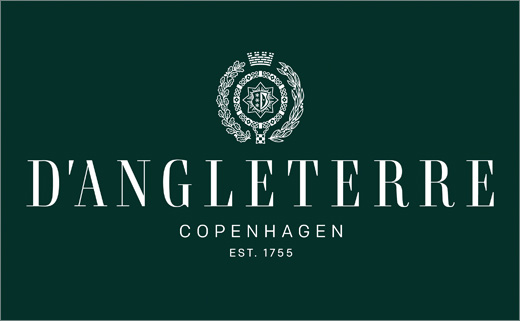
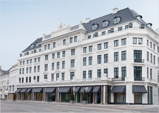
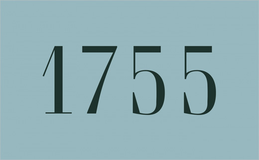
The Hotel d’Angleterre was originally established in Copenhagen in 1755.
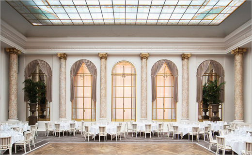
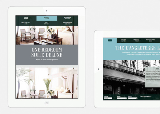
After a full renovation and the reopening as a revitalised grand palace in spring 2013, the hotel wanted a new visual identity aiming at strengthening its position as a fashionable and cultural hotspot in the city.
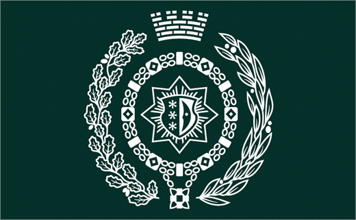
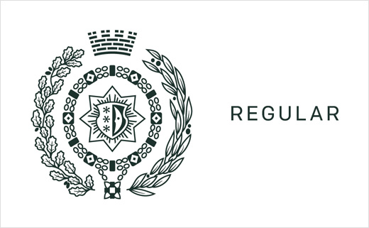
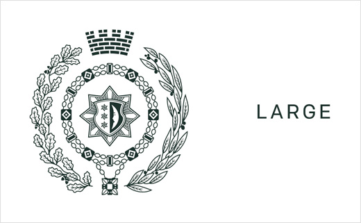
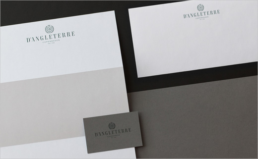
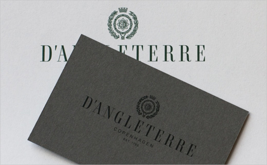
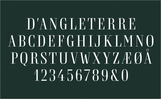
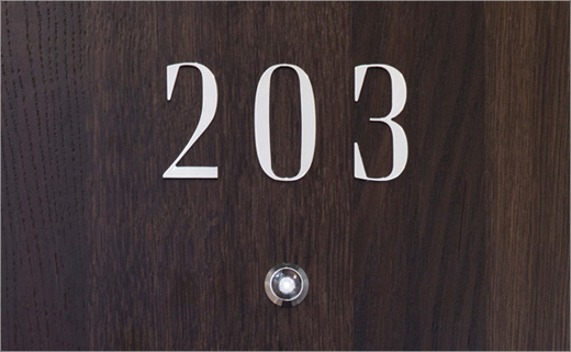
Building on 250 years of tradition, the revitalised identity centres on a bespoke typeface that is classic in its design, yet modern in its proportions.
The use of sober regal colours and a visual language that stages the hotel’s classic ambiance help contribute towards further underlining the prestigious exclusivity of the lodging.
Designed by Danish branding consultancy Kontrapunkt, the identity has been awarded a “Red Dot: Best of the Best” award in the 2013 Communication Design category.
Commenting on the project, the Red Dot jury said: “Commissioned as part of the full renovation of the Hotel d’Angleterre, the redesign of the hotel’s corporate identity as well as its logo aimed at subtle modernisation. Respecting the long tradition of the house, the new identity emerged as a fantastically implemented, overall minimalist and Nordic appearance.”

Kontrapunkt
www.kontrapunkt.com


