Logo and Packaging Design for Marou Chocolate
Founded by a couple of Frenchmen living in Ho Chi Minh City (Saigon), Marou Faiseurs de Chocolat has the honour of being Vietnam’s first single-origin gourmet bean-to-bar chocolate producer.
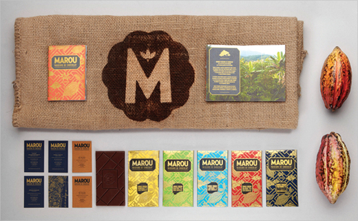
Marou brought in design agency Rice Creative at the very outset, tasking the latter to build the brand’s visual identity and packaging.
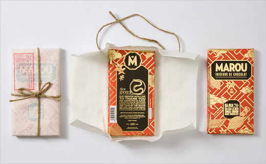
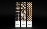
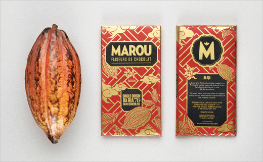
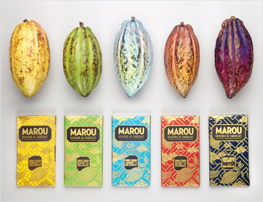
“We wanted the packaging to be strongly linked to Vietnam,” explains Chi-An De Leo, one of Rice Creative’s founding partners. “We began collecting beautiful ceremonial papers that are still produced by artisan printers in Cho Lon, the old Chinese quarter of Saigon. These papers are hand printed with intricate traditional lattice patterns. Typically, the patterns are adorned with illustrated fruits, flowers and auspicious animals.
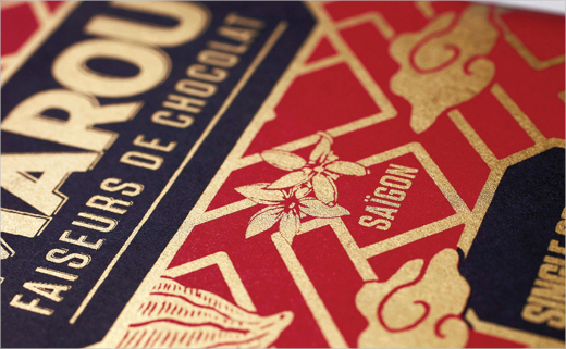
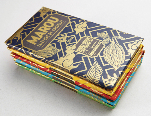
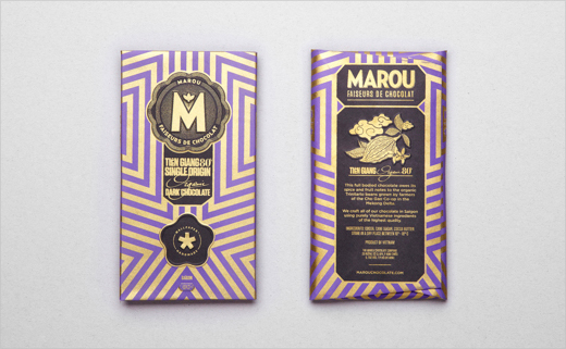
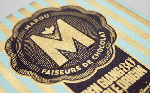
“Inspired by this illustration style we hand drew our own original chocolate oriented ornaments of cacao pods, flowers and leaves, throwing in some heavenly looking clouds for the tropical monsoon. Our custom lattice pattern keeps a traditional look and creates a framework to incorporate some modernist typography, inspired by the old signage still found around the country,” adds Chi-An.
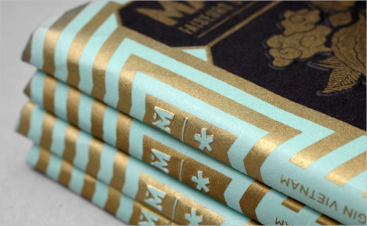
To emphasise the hand-made, artisan nature of the chocolate, the designers had the wrappers hand-printed using traditional silk-screen printing techniques. The finished packaging was then transferred to Marou who continue to hand-wrap the chocolate bars.
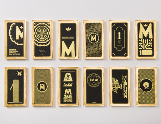
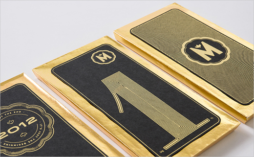
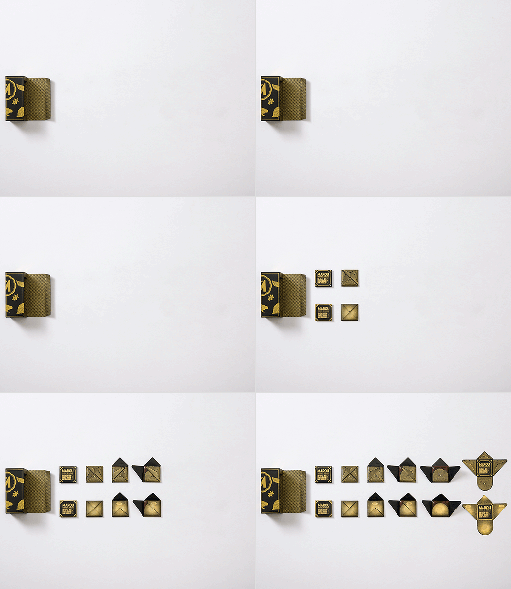
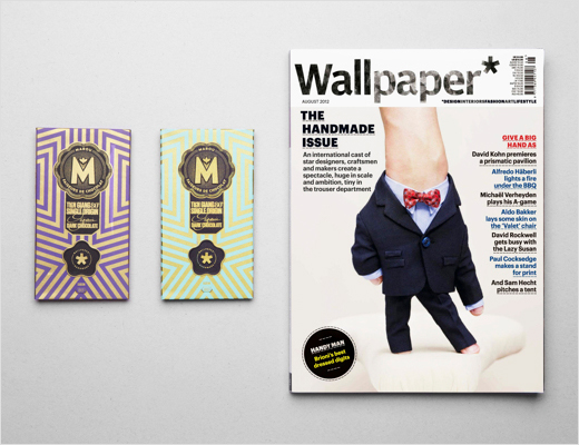
Rice Creative has also been responsible for designing additional, one-off custom packaging solutions for Marou, such as when the chocolate maker celebrated its first anniversary, and when it was featured in a special edition of Wallpaper* magazine.
Rice Creative
www.rice-creative.com


