A-Moloko Branding
This visual identity was designed and developed by Ermolaev Bureau, a graphic design studio from Moscow in Russia.
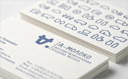
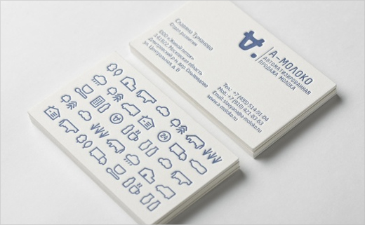
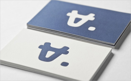
The concept behind the logo was inspired by the particular nature of the client’s business activity; namely, the automated sale of farm-fresh milk via a chain of vending machines. The company’s name, A-moloko, which was also formulated by Ermolaev Bureau, influenced the logo’s design as well. For instance, the first letter “A”, when turned upside down, is meant to resemble a cow’s teat.
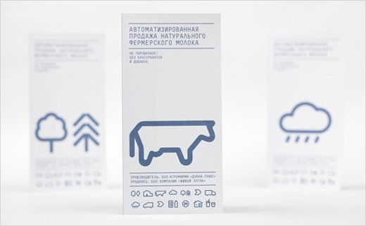
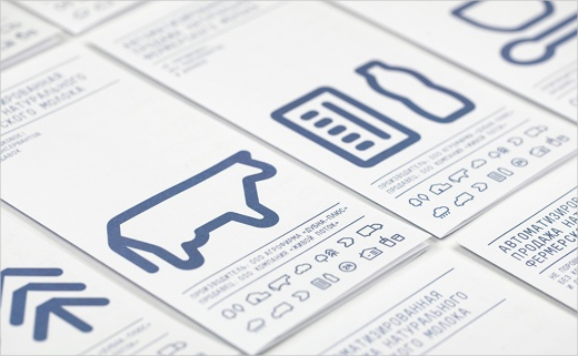
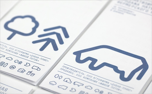
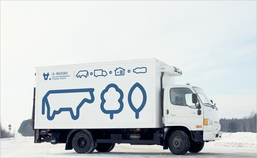
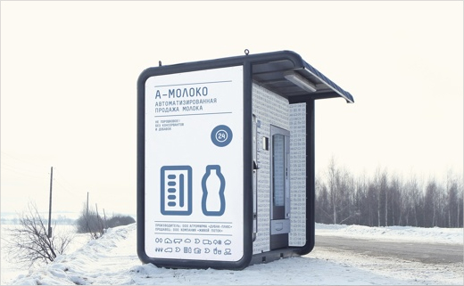
In fact the entire visual identity is built on a clear and deliberate system of symbols, which collectively describe the milk’s path from cow to consumer. In terms of colours, the designers restricted their palette to only blue and white for added emotional appeal.
The design project has already received industry recognition by winning several prestigious awards, including a Red Dot Design award and also a European Design Award (ED-Awards).
Ermolaev Bureau http://www.facebook.com/pages/Ermolaev-Bureau/246305002133820
A-Moloko www.a-moloko.ru


