999 Design Creates New Visual Identity for Affinity Sutton
Affinity Sutton is a national housing association with 57,000 properties stretching across 120 local authorities in England.
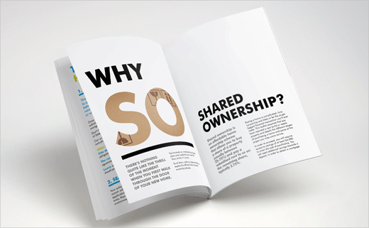
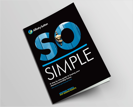
Their marketing team approached 999 Design to devise a visual identity for their ‘Shared Ownership’ offering and promote the association’s scheme to help tenants take their first steps onto the housing ladder.
“Due to the low awareness and confusing terminology surrounding the shared ownership market, potential house buyers often don’t understand which product is suited to them or how shared ownership actually works. A relatively unknown brand in the housing market, there was the additional challenge of positioning the association so consumers would choose to buy through Affinity Sutton rather than a competitor,” says 999 Design.
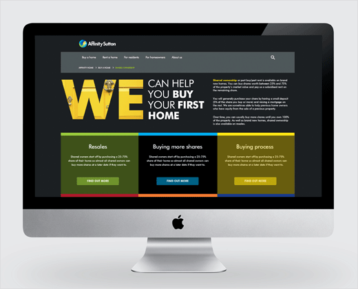
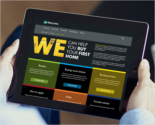
In order to engage the target audience, the new visual identity needed to work across a variety of channels from web banners and brochures to press advertising and signage.
“Taking a highly visual approach to inform, educate and motivate, key words were selected, coupled with a very ‘human’ and ‘approachable’ tone of voice. Jargon was put firmly aside to help people navigate this tricky area,” explain the designers.
The new identity is structured around three specific words: SO – to explain what shared ownership is and how it works; WE – to raise Affinity Sutton’s experience and brand; and GO – to prompt action.
“Working with Affinity Sutton on their ‘Shared Ownership’ offering presented an interesting challenge. We found the first-time buyer marketplace to be confusing with many eligible candidates not even a ware that shared ownership was an option available to them. By introducing a direct and approachable tone of voice, coupled with strong visual cues, we were able to cut through the jargon – filled marketplace and offer some reassurance to potential home owners,” says Katie Gaughan, lead campaign designer at 999 Design.
999 Design
www.999design.com


