Rose Completes Branding for the English National Opera
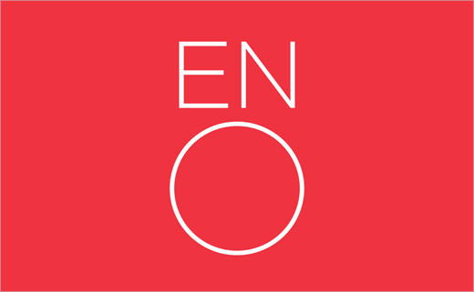
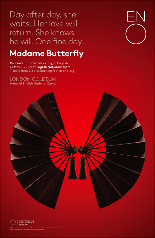
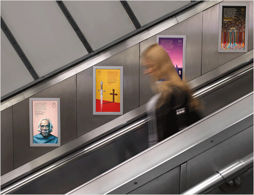
Design agency Rose has completed the rebranding of the English National Opera (ENO). The new look includes a refreshed logo as well as a new marketing strategy and visual identity.
The change comes after the Arts Council England announced plans to cut funding across the whole cultural sector in early 2014; the resulting cuts saw £5m taken from ENO’s funding.
Rose were subsequently appointed to review the ENO brand in late 2014, following a credentials pitch against several other brand consultancies. The agency says it was briefed to help ENO “connect with new and broader audiences”.
“Opera has long been perceived as an elitist and expensive art form, generally sung in a foreign language, and as a result, audiences who are otherwise culturally literate and enjoy many other art forms, assume opera isn’t for them,” says Simon Elliott, partner at Rose. “We wanted to change this perception.”
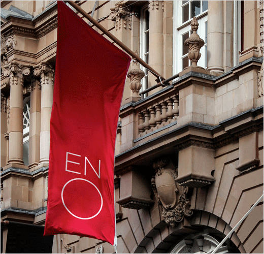
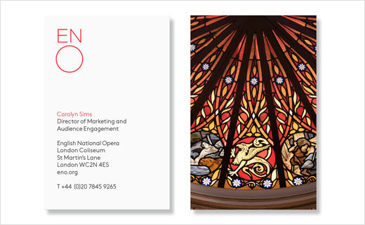
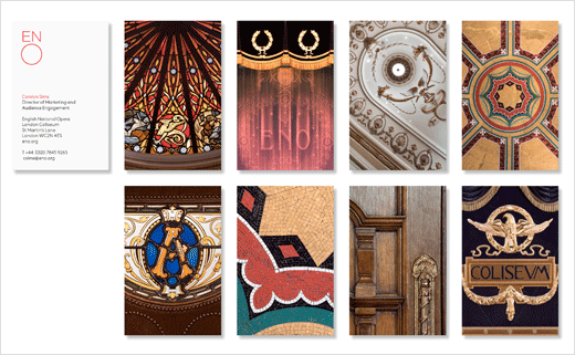
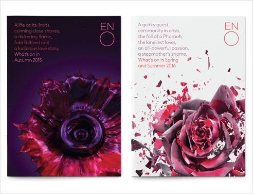
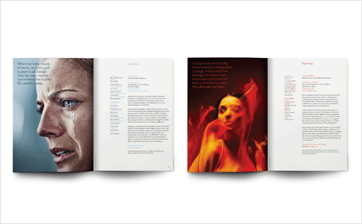
The new logo was in fact previewed last year, and retains the “singing” O mark of the original design, which was created by Mike Dempsey back in 1991. However, the redrawn version is slimmed down using a bespoke cut of FF Brown; the new typeface is also now used throughout all ENO communications.
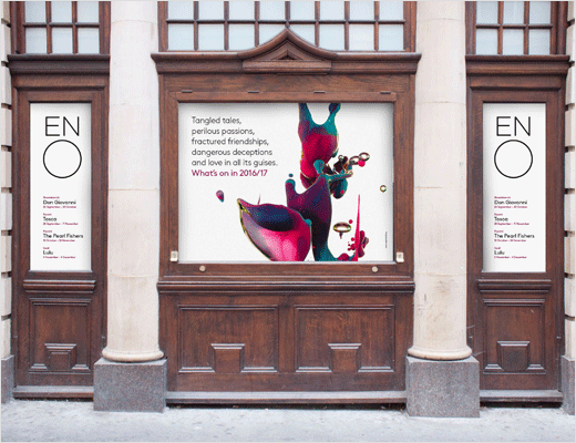
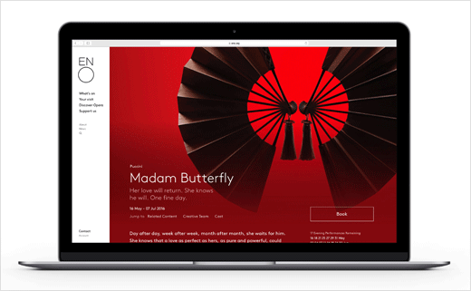
In addition to the revised logo, Rose has developed several other areas of the brand experience in a variety of different media, for example, working with digital agency Substrakt to develop ENO’s new website.
Rose further worked with animation agency FGreat to create a custom online animation to specifically help market Madam Butterfly.
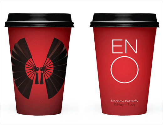
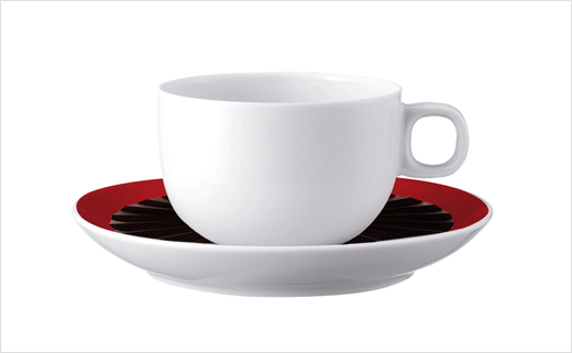
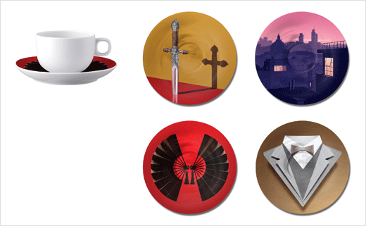
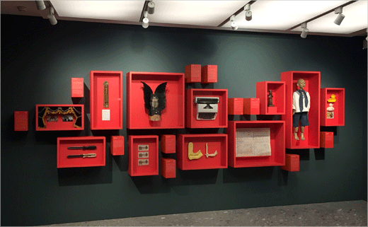
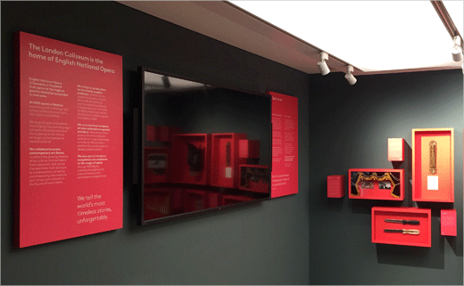
They also developed cafe items – permanent chinaware, in addition to take-away cups and bags – for the new cafe, run by Benugo, and staff uniforms, signage and way-finding throughout the Coliseum, which will be implemented in the next phase of The London Coliseum’s transformation.
Rose
www.rosedesign.co.uk


