PG Tips Gets New Logo and Packaging Design
PG tips, said to be the UK’s number one tea brand from Unilever UK, is revamping its entire range with a brand new pack design – the biggest change from the brand since it introduced its pyramid teabags in 1996.
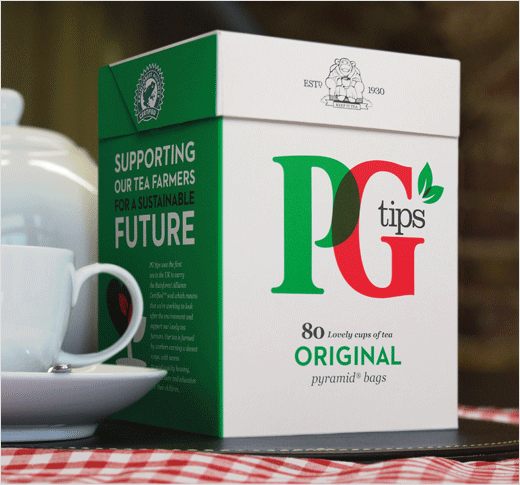
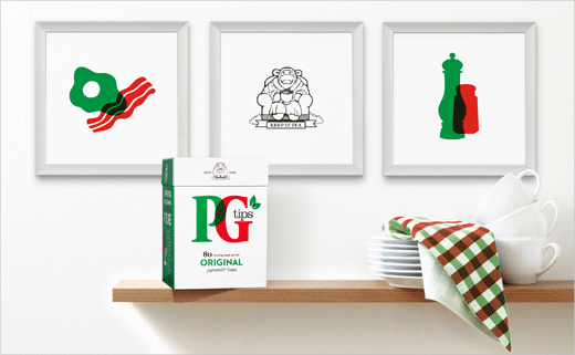
The new packaging has been overhauled by Jones Knowles Ritchie in an attempt to make the brand easier to shop instore, reaffirm its authority within the category, and drive sales uplift amongst new and existing shoppers.
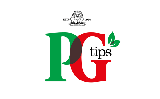
Each pack will continue to carry the colours of red, green and white synonymous with PG tips, but with a brand new logo that the designers claim delivers increased standout on shelf.
Kate Hearn, senior brand manager for PG tips at Unilever UK, comments: “We’ve listened to our consumers and redesigned our packaging to make the brand more relevant to shoppers, especially the younger consumer. We also believe that the clear, fresh new look, with a bigger and bolder PG tips logo, will make it easier for shoppers to find their favourite tea brand in the busy supermarket aisle.”
