Pentagram Creates Identity for VC Firm – ‘First Round’
Pentagram’s Natasha Jen and her team have designed a new identity for venture capital firm, First Round Capital. The new identity launches as First Round celebrates its 10th anniversary this year.
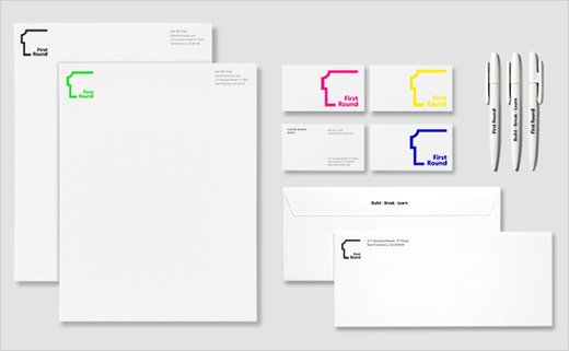
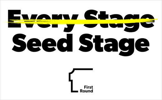
Avoiding typical VC imagery like financial symbols and growing trees, the logo adopts a simple line derived from the number “1,” inspired by the company’s name.
The designers say the line suggests the diagram of a floor plan, with one side left open to convey a sense of possibility. The shape of the line also creates a profile, hinting at the personal, one-to-one connections said to be valued by First Round.
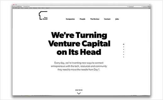
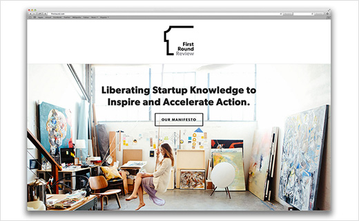
The logo is balanced by the company’s name, set in the sans serif font Gibson, and further extends to communications like the website and digital platform, which incorporate white space for a clean look.
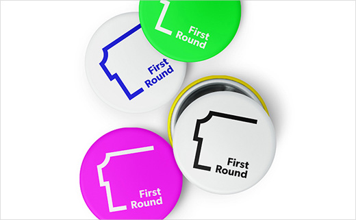
The logo also appears in a bright palette of contemporary colours like neon green and orange in collateral like stationery, totes and buttons.




Pentagram
www.pentagram.com


