Luxury Real Estate Firm ‘Halstead’ Rebranded by Pentagram

Pentagram has created the new identity for Halstead, a residential real estate brokerage firm headquartered in the New York metropolitan area.
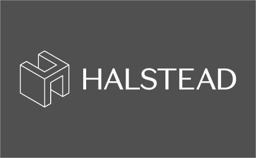
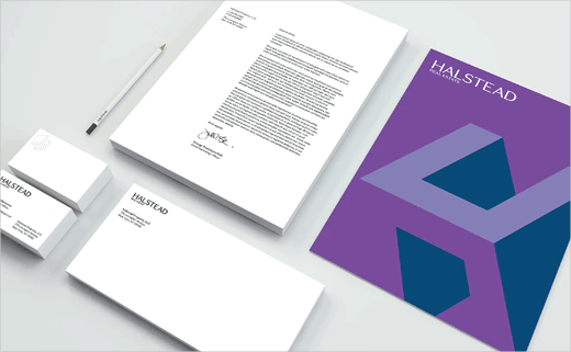
The new look, which centres around a dimensional, changing letter "H", encompasses brand positioning and messaging, environmental graphics and marketing campaigns, as well as the company's website.
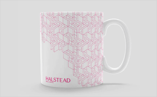
"The reimagined 'H' icon is architectural and spatial, offering the ability to stand alone as well as the flexibility for rotation, use in endlessly expanding patterns, and as a window for photography, or even as a directional arrow," explain the designers.
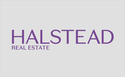
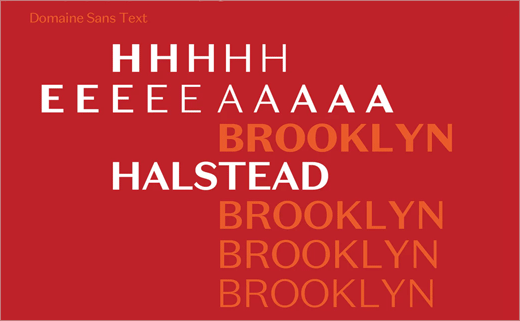
The accompanying logotype is set in a Klim Type-designed sans serif, namely, Domaine Sans, while the company name has also been changed to simply read "Halstead", with "Real Estate" only being added "when needed".
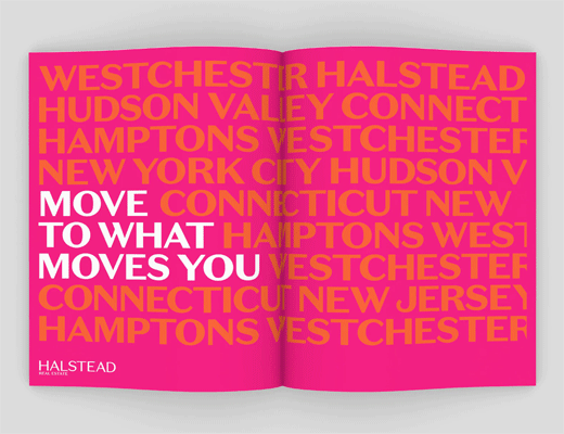
The corporate colour set, meanwhile, consists of a palette of greys, while three additional colour sets are said to reflect the company’s various markets throughout the tri-state region – Manhattan, the outer boroughs and the suburban areas.
"Our variety of palettes taps into a growing movement in design that redefines the role of colour in corporate branding. Alongside strong visual elements, this use of colour allows you to appeal in a deeper way to audiences by tapping into more visceral connections that people may have to things like regions, seasons and emotions," says Matthew Leone, marketing boss at Halstead.







Pentagram
www.pentagram.com


