Interbrand Creates Identity for LATAM Airline
LATAM Airlines Group bosses have announced the new LATAM brand, result of the union between LAN and TAM airlines.
The company says the new brand is a result of almost two years of work with brand consultancy Interbrand, in its Sao Paulo, Santiago and Madrid offices.
The new name “LATAM” is formed by a hybrid of “LAN” and “TAM”. Used as an abbreviation for “Latin America”, LATAM is a name that “precisely illustrates” the company’s new identity, according to the designers.
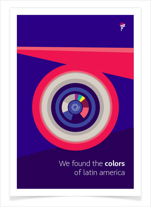
“The lines in the new logo are inspired by a figurative representation of the continent’s own geography. Coral and indigo are the brand’s new main colours. Indigo is the result of the intersection of red and blue – colours of TAM and LAN, respectively – and symbolises LATAM’s efficiency and elegance. Coral represents the brand’s passion and care for their customers,” explain the designers.
The announcement of the new brand is the first part of the project developed by Interbrand, which includes the process of internal engagement and curating all the brand’s touch-points with its stakeholders. “LATAM is not only a new identity: it is the realisation of a new experience”, says Beto Almeida, managing director of Interbrand São Paulo.
In a gradual three year process that begins in 2016, there will be several developments across the brand, from environmental identity in airports and offices, to employee uniforms and the aircrafts themselves.

Interbrand
www.interbrand.com


