Instagram Reveals New Logo Design
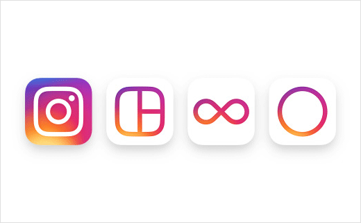
Facebook-owned photo-sharing app Instagram has unveiled a new logo. The refreshed design is also accompanied by updated icons for its family of apps: Layout, Boomerang and Hyperlapse.
While the new icon takes certain cues from its old friendly-looking, Polaroid-inspired camera icon, the new version adopts a cleaner, simpler look. However, the rainbow lives on, albeit in gradient form.
“Brands, logos, and products develop deep connections and associations with people, so you don’t just want to change them for the sake of novelty,” said Ian Spalter, Instagram’s head of design. “We realised we needed to move past a rendered camera to get a flexible, scalable glyph, but the previous glyph proved to be a weak basis for an icon. To maintain the previous icon’s gravity, we had to figure out how to give the new mark more character while also removing what was unnecessary.”
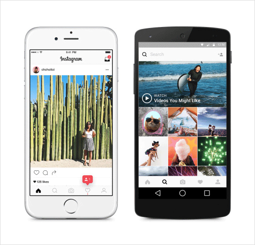
In addition to the new icon, Instagram has also revised the look of the app itself. The company says the new black-and-white design adopted for the backgrounds, icons and menus is intended to make photos stand out more.
According to Facebook boss Mark Zuckerberg, the app now has more than 400 million active users. Instagram was sold to Facebook back in 2012 for $1 billion.

Source: Instagram


