How Studio Blackburn Created the Trainline Logo
Brand design consultancy Studio Blackburn has revealed the workings behind the major new rebrand of the Trainline, a service that is said to reach over six million UK users.
Trainline had existed for many years as thetrainline.com, but felt that an adjustment of the name to ‘Trainline’ and a brand redesign was needed to position them as leaders in the world of digital ticketing, and enable their offer to grow to accommodate international bookings.
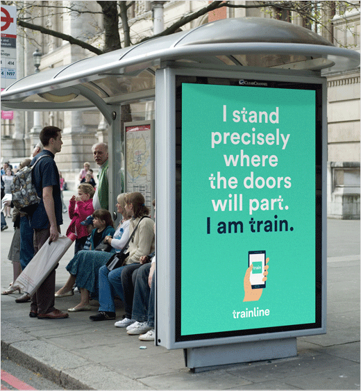
Studio Blackburn was tasked with creating a brand and creative strategy in order to develop a narrative and visual language for the brand across a variety of media - bus sides, posters, mobile, App and website etc.
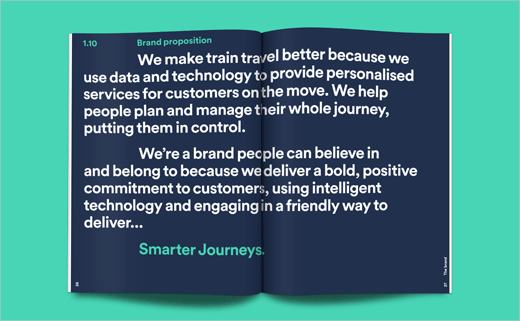
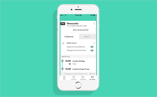
"Trainline had moved from a desktop digital brand to a mobile one, with people using their phones to organise travel. The core of the Trainline offer is saving on journeys, but mobile also offers the brand a means to add huge value to the customer by monitoring travel updates in real time and ensuring they get the most out of their experience in advance of and during their journey," explain the designers. This new insight led the team to the brand proposition of ‘Smarter Journeys’.
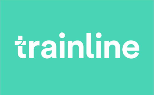
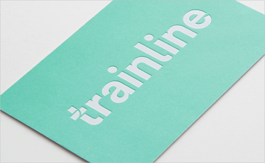
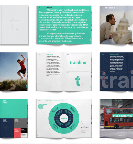
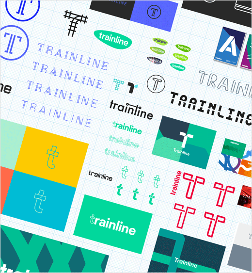
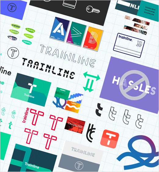
The designers then developed a logotype and look and feel that adopts a new typeface to ensure that the Trainline wordmark and all Trainline communications are instantly recognisable.
"The t-symbol suggests routes or crossing-points – the meeting point of smart technology and the romance or convenience of a real world travel experience," say the designers. "As a distillation of the brand promise, the t-symbol will become short-hand for Trainline - and for smarter journeys. The t-symbol is also provided as a typographic glyph within the corporate typeface that it is set in, a smart design solution ensuring that the typeface and logotype work together seamlessly and reinforce the unity of the design solution."
Based on the growth in mobile, Studio Blackburn made the decision to drop the ‘.com’ and highlight Trainline’s multi-channel offering.
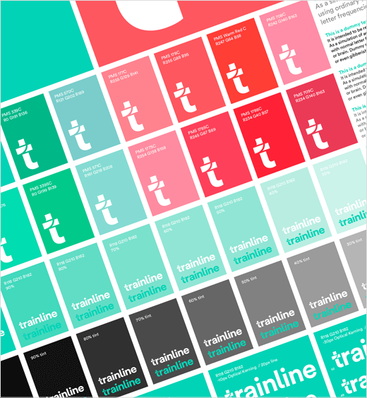
In terms of colour, the design team chose to update the old ‘acid’ green to a "fresher and optimistic" mint green and supported this with an extended palette that also includes a more corporate-style blue, as well as a bright pop colour coral.
The final mint green colour is made up of C76 Y38 and was tested in increments of cyan and yellow in each direction for almost four weeks before the team agreed on the final spec with the client.
"Our redesign of the Trainline brand identity is proof that a compact and highly skilled team can deliver creative and strategic results for even the biggest digital brands. There’s something very pleasurable in knowing that designs by our creative team have found their way onto the phones (and into the pockets) of six million customers in the United Kingdom and beyond," says Paul Blackburn, creative consultant and Studio Blackburn founder.
Studio Blackburn also worked with agency partner Anomaly to build brand awareness and positioning.




Studio Blackburn
www.studioblackburn.com


