Cambridge University Boat Club Reveals New Logo by Offthetopofmyhead
Design agency Offthetopofmyhead has created the new logo and identity for Cambridge University’s Boat Club.
At the start of last month, three separate rowing clubs from the world-famous university, namely, Cambridge University Boat Club, Cambridge University Women’s Boat Club, and Cambridge University Lightweight Rowing Club, unified to become one new club – for both men and women who row for Cambridge in the iconic Boat Race against perennial academic rivals Oxford University.
Known as The Championship Course, the Boat Race covers 4.23 miles and takes place each year on the River Thames in London.
Cambridge University Boat Club was originally founded in 1828 and the first boat race against Oxford took place the following year in 1829. The first women’s Boat Race, meanwhile, came almost a century later, after which Cambridge University Women’s Boat Club was formed.
A new club, Cambridge University Lightweight Rowing Club, was founded in 1974 to provide a lightweight men’s crew to race Oxford. When a lightweight women’s event was established in 1984, the new squad of lightweight women joined Cambridge University Women’s Boat Club.
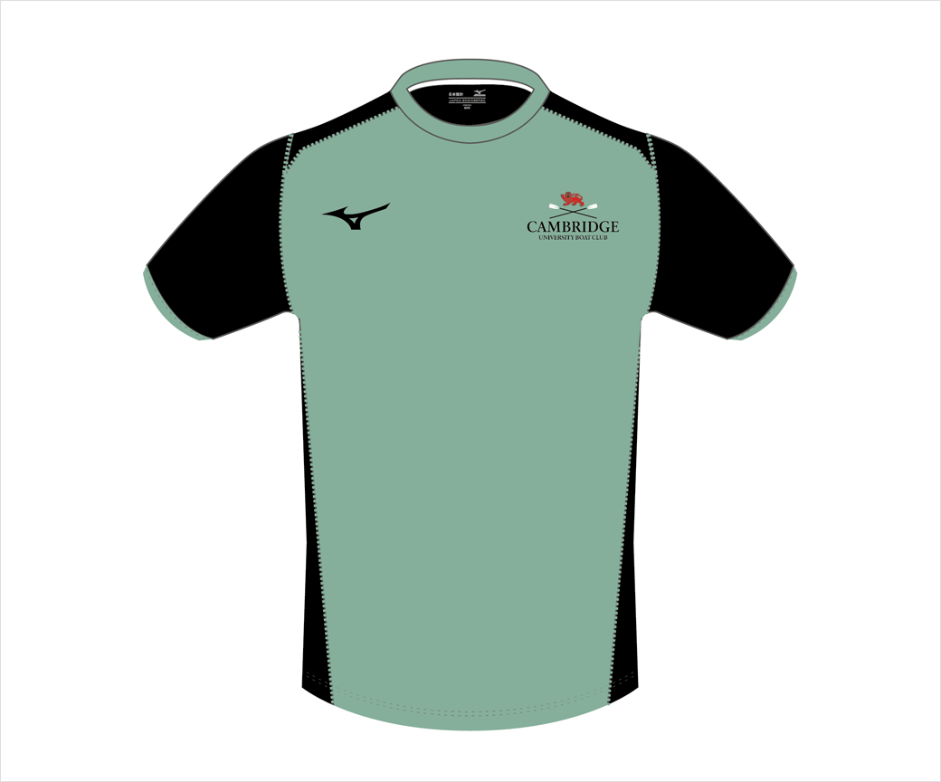
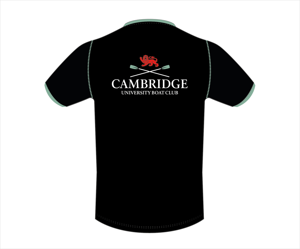
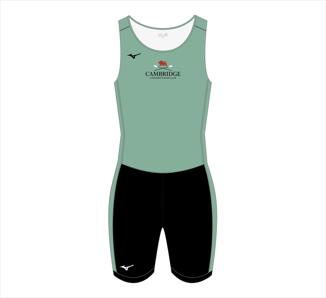
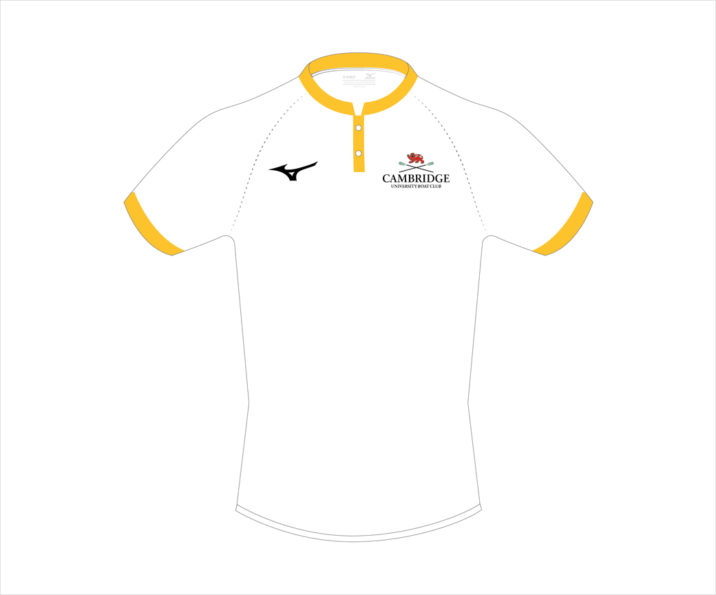
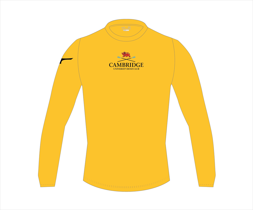
The Club’s logo is said to be its public face; it features on team kit, it is shared with sponsors, and it most often appears on clothing and promotional items. However, multiple versions of it had evolved over the past 150 years.
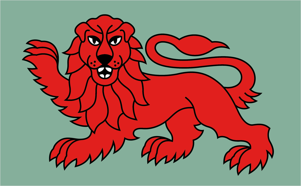
“There was little consistency in the appearance of the three boat club logos except they all comprised a red lion, crossed oars and the club name. The red lion had also been redrawn many times over the years, so there was no definitive version. The whereabouts and appearance of the original is unknown. In an age of increased commercialism and sponsor pressures it was imperative for Cambridge University Boat Club to define, document and protect its graphic assets,” explains Offthetopofmyhead’s founder and creative director, John Spencer.
Adding: “The red lion is the symbol of sport at the University of Cambridge. We were asked to evolve a new version, based on the best of the University’s various lions, to be used not only by Cambridge University Boat Club but by all the University’s sports clubs. We’ve redrawn the crossed oars and taken the namestyle directly from the University of Cambridge’s logo to emphasise the bond between the University and the Club”.
Incidentally, it was also John who refreshed the University of Cambridge’s main logo back in 2008 when he created a University-wide publications system for the 810-year-old institution.
With regards to the next Boat Race, it is expected to take place in the spring of 2021, after having been cancelled this year as a result of Covid-19, which marked the first time it had come to a halt since World War II.

Offthetopofmyhead
www.offthetopofmyhead.co.uk


